


Most businesses have a logo. Far fewer have the framework that tells everyone how to use it. A logo sitting in a Dropbox folder with no surrounding documentation isn’t a brand — it’s a starting point that gets interpreted differently by every designer, vendor, employee, and freelancer who touches it. The result is a slow, invisible accumulation of inconsistency: the wrong shade of blue on a trade show banner, a font substitution on a vendor’s print run, a social post that sounds nothing like the website, a pitch deck that looks like it came from a different company entirely. Brand guidelines development exists to prevent exactly this — not by restricting creativity, but by giving everyone who represents the brand a shared foundation to work from.
The businesses that scale cleanly — the ones that look and sound just as coherent at 200 employees as they did at 20 — almost universally have a comprehensive set of brand standards behind that consistency. This guide walks through every section of a professional guidelines document, the real cost of skipping it, and what a properly built system actually enables.
The Real Cost of Having No Brand Guidelines
The damage from inconsistent branding rarely shows up as a single dramatic failure. It accumulates quietly — in the small disconnects that individually seem minor but together erode the coherent identity a business needs to be remembered, trusted, and chosen over alternatives.
A Real Example of Inconsistency at Scale
A regional home services franchise came to us after rapid expansion had left them with a visual and messaging problem. Each new location had been set up using slightly different versions of the brand assets — different contractors, different designers, different interpretations of what the brand should look like. By the time they had eight locations, no two were visually consistent. The company’s social media accounts, vehicle wraps, uniforms, and website all looked like loosely related cousins rather than a unified brand. Customer surveys were flagging confusion about whether the locations were even the same company.
The fix required rebuilding from the asset level up — not because the original brand was wrong, but because it had never been documented clearly enough for others to apply it correctly without interpretation. The cost of that rebuild far exceeded what a proper guidelines document would have cost at the outset. That’s the math behind brand consistency: invest once in documentation, or pay repeatedly to correct divergence.
What Brand Guidelines Actually Are (And Aren’t)?
Brand guidelines — sometimes called a brand bible, style guide, or brand standards document — are the definitive reference for how a brand should look, sound, and behave across every context it appears in. They’re written for designers, marketers, vendors, partners, and employees — anyone whose work will represent the brand publicly.
Guidelines Enable Speed, Not Just Consistency
The liberating aspect of comprehensive guidelines is often undersold. When a new team member joins the marketing team and needs to create a social post, clear guidelines mean they don’t need to ask for approval on every detail — the decisions are already made. When a vendor needs to produce printed materials, they have an exact reference rather than guessing. When a new designer takes over a project mid-stream, handoff is clean. Guidelines don’t slow creative work down; they remove the friction that slows it down.
Section One: Logo Usage Rules
The logo section is typically the most detailed in any guidelines document, because logos are the most frequently misused brand asset. Without explicit rules, logos get stretched, recolored, placed on competing backgrounds, surrounded by insufficient clear space, and reproduced at sizes that make them illegible.
What Logo Rules Should Cover?
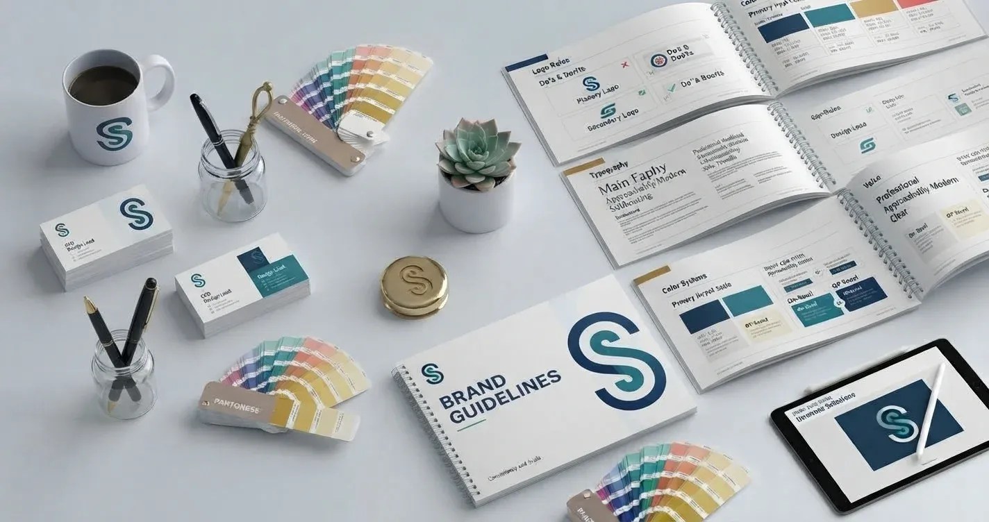
A complete logo section covers the approved variations (primary, secondary, icon-only), clear space requirements around each version, minimum size specifications for both print and digital, approved color treatments (full color, single color, reversed white), and explicit do’s and don’ts showing common misuse. The do’s and don’ts are often the most practically useful section for non-designers — seeing “don’t do this” with a visual example prevents misuse more effectively than a written rule alone.
File Format Guidance
Logo usage rules should also specify which file format to use in which context — vector files (SVG, EPS, AI) for print and large-format applications, PNG with transparency for digital overlays, JPG for backgrounds. Without this guidance, vendors default to whatever format they have, which frequently produces quality problems that a format specification would have prevented entirely.
Section Two: The Color System
Brand color isn’t just about aesthetics — it’s one of the most immediate and powerful recognition signals a brand has. Studies consistently show that color alone accounts for a significant portion of brand recognition on first exposure. A precise, documented color palette is what keeps that recognition signal consistent rather than drifting slightly with every new application.
Primary, Secondary, and Accent Palettes
A well-documented color system defines the primary palette (the core brand colors used most frequently), a secondary palette (complementary colors for supporting elements), and accent colors (used sparingly for emphasis). For each color, every relevant specification is documented: HEX codes for digital, RGB values for screen, CMYK breakdowns for print, and Pantone references for precision print production. Using a hex code when a Pantone match is available is the difference between brand colors that stay consistent and colors that shift subtly from printer to printer over years of production.
Usage Proportion Guidance
Color systems benefit from proportion guidance — roughly what percentage of a design’s visual real estate each palette tier should occupy. Without this, secondary and accent colors can gradually creep into primary color territory, visually diluting the brand over time.
Section Three: Typography System
Typography is the element most likely to be quietly substituted when guidelines don’t exist — often because a specified font isn’t available on a vendor’s system, and the substitution happens without anyone flagging it. A documented typography system prevents this by specifying not just the primary typeface but also the approved fallback stack for contexts where the primary font isn’t available.
What a Typography System Defines?
Primary heading font, body copy font, accent or display typeface where applicable, and the hierarchy that governs how each is used: font weights, sizes, line spacing, and letter spacing for each text level (H1 through body copy). Pairing rules — which fonts work together and in what proportions — prevent the visual inconsistency that comes from different designers making independent type choices across different touchpoints.
Digital vs Print Type Specifications
Typography often needs separate specification for digital and print contexts. Web fonts need to account for rendering differences across browsers and operating systems; print type requires attention to reproduction at different sizes and paper stocks. A single specification trying to serve both contexts can fail both — separating them produces better results in each.
Section Four: Imagery Style
Photography and illustration choices are the part of visual identity most often left undocumented, and their absence shows. Two brands can use identical logos and color systems and still look completely different from each other because one uses warm, natural, human-centered photography and the other uses cold stock imagery that could belong to any company in the category.
Defining the Visual Language
An imagery style section defines the visual language in concrete, actionable terms: the mood and lighting style for photography (natural light vs. studio, warm tones vs. cool, lifestyle vs. product-focused), the types of subjects featured, what to avoid (overused stock clichés, competing brand colors in background elements, imagery inconsistent with the brand’s personality), and illustration style where applicable. Reference imagery — a mood board of approved directions and rejected directions — is worth more than paragraphs of written description for this section.
Section Five: Brand Voice and Tone
The visual elements of brand standards are typically more intuitive for businesses to develop than the verbal elements, but brand voice and tone of voice documentation is equally critical — and often more difficult to maintain consistently without it. A brand that sounds authoritative in its website copy but casual on social media, formal in email and chatty in its sales materials, doesn’t have a voice problem: it has a guidelines problem.
Voice vs Tone: The Distinction That Matters
Voice is consistent — it’s the brand’s fundamental personality, present in every piece of communication regardless of channel. Tone is contextual — the way that consistent voice adapts to different situations. A brand might be consistently straightforward and expert in its voice while its tone shifts from empathetic and patient in customer service interactions to confident and direct in sales materials. Documenting both — the constant and the variable — gives writers enough guidance to be consistent without feeling constrained.
Practical Voice Documentation
Effective voice documentation includes three to five core personality descriptors with explanation, “we are / we are not” contrast statements that clarify the voice in context (e.g., “we are direct, not blunt; we are expert, not condescending”), and before/after copy examples showing the difference between on-brand and off-brand writing. Examples are the critical ingredient most voice documentation omits — abstract adjectives alone don’t give writers enough to work from.
Section Six: Do’s and Don’ts
The do’s and don’ts section is where guidelines become immediately practical for non-specialists. Rather than requiring a designer to interpret rules correctly, explicit visual examples of what to do and what to avoid remove interpretation from the equation entirely.
What Belongs in This Section?
Common misuses of each brand element — logo stretching, unauthorized color modifications, off-palette color combinations, inappropriate font substitutions, imagery that conflicts with the established style — each paired with a visual example. The more specific the examples, the more useful the section: showing the exact unapproved treatment next to the correct one is more instructive than describing the error in text.
How to Structure Brand Guidelines for Different Audiences?
A single document trying to serve both internal teams and external vendors often serves neither well. Internal teams need enough context to understand the reasoning behind guidelines, which builds genuine brand understanding rather than rule-following. External vendors typically need clear, quick-reference specifications without the surrounding narrative.
Modular Guidelines Work Best at Scale
The most scalable approach is a modular design system: a core comprehensive document for internal use, paired with condensed quick-reference sheets for specific vendor applications (print specifications, digital asset specs, social media format guides). As the business grows and the brand touches more channels and more people, modular documentation makes updating individual sections without rewriting the whole document far more manageable.
Bringing Brand Guidelines to Life
A guidelines document sitting in a shared drive folder that nobody knows about produces exactly the same outcome as no guidelines at all. The investment in brand guidelines development only compounds when the document is actively introduced, made genuinely accessible, and treated as the authoritative reference it was built to be.
The franchise example at the start of this article didn’t fail because their brand was weak — it failed because the brand was never documented clearly enough for others to apply it without interpretation. The same brand, properly documented and actively distributed, would have scaled cleanly. That’s the real case for brand standards: not restriction, but scalable clarity that makes everything downstream faster, more consistent, and more effective.
Ready to build brand guidelines that actually get used and actually keep your business consistent? Talk to our brand guidelines development team and get a standards document built to scale with your business.
Frequently Asked Questions
Start with the six core sections: logo usage rules, color system, typography, imagery style, brand voice and tone, and do’s and don’ts. Build each section with specific, visual documentation rather than abstract description — guidelines that show what to do and what to avoid are used; guidelines that only describe are often ignored.
At minimum: logo variations and usage rules, exact color specifications across HEX, RGB, CMYK, and Pantone, typography hierarchy and pairing rules, imagery style guidance, brand voice and tone documentation, and explicit do’s and don’ts for each element. Additional sections for specific channels (social media, print, digital advertising) add value as the brand scales.
There’s no universal answer, but most professional brand guidelines run between 20 and 60 pages depending on the brand’s complexity and the number of channels it operates across. More important than length is completeness — a 15-page document that covers every critical element is more useful than a 60-page one that repeats itself without adding specificity.
Review guidelines annually or whenever there’s a meaningful brand evolution — a new product line, a rebrand, an expansion into a new market or channel. Guidelines should be living documents that evolve with the brand, not static references that become outdated and then get ignored.
Strongly yes. Small businesses working with external vendors, freelancers, or growing teams are exactly the context where undocumented brand standards cause the most visible damage. The investment in guidelines scales directly with the number of people and external parties representing the brand — the more touchpoints, the more critical the documentation becomes.
Discover more from Web Pivots®
Subscribe to get the latest posts sent to your email.


You must be logged in to post a comment.